The Crane Through the Ages:
Re-designing an Aviation Pioneer
“Many things change. The good things remain." This is the motto behind Lufthansa’s approach to a more digital world and some fundamental changes not seen for approximately 30 years. Otl Aicher designed the visual appearance of Lufthansa in the 60s and it has become one of the most important corporate designs of the last century. The expectations concerning the re-design of this long-established brand are therefore sky-high.
Lufthansa Ju-52
Our Hommage to the Queen of the sky
rivet rocker Lufthansa
One step in the modern world
Compared to today’s world, digitalisation was of little importance in Aicher’s days. The demands have changed considerably over the past decades. Digital developments have made it necessary to re-design “not only the production side, but also the design elements” – as is communicated to their own employees in a company information campaign.
The Lufthansa Crane – the figurative mark that is recognised by people around the world – is given special attention not only by designers. The company logo’s 100th birthday was taken as an opportunity to analyse the visual appearance and the contemporary nature of the brand and to develop it further with great care. Above all, the new appearance should be sustainable. That is why the new logo and corporate design are kept in a classic look following the clear lines of the Bauhaus design style. The idea behind it is an “evolution not revolution”. Therefore, the design is introduced gradually and only visible to the customers little by little.
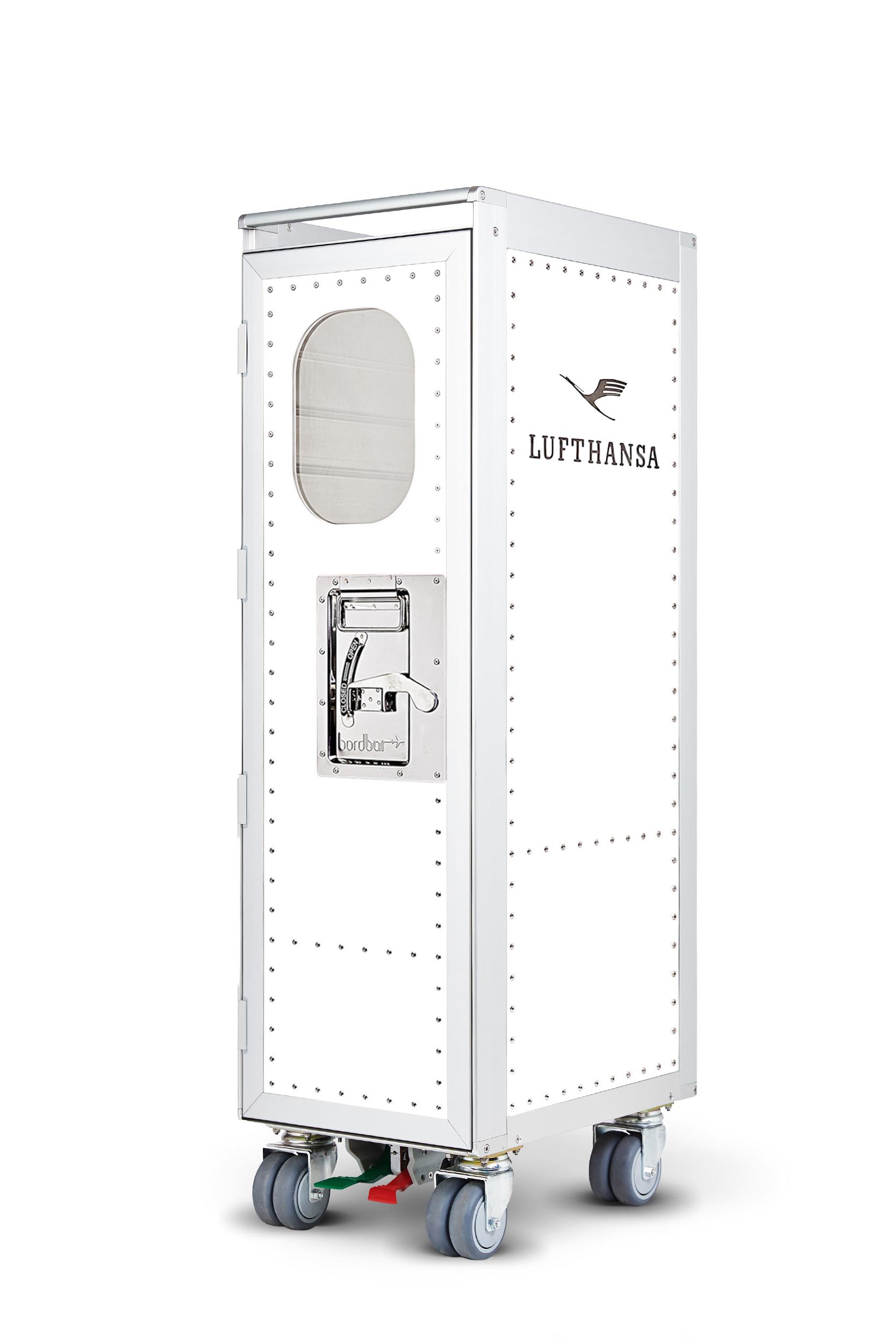
Lufthansa’s new brand elements have now also found their way to bordbar, gracing timeless, classic aircraft trolleys with the sleek Lufthansa design. Of course, as a licensed Lufthansa partner, we still have selected items in our range for all you retro design aficionados.
Personal configurations (0)
Your configurations are saved for a maximum of 60 days.
You have not created any configurations yet.
